
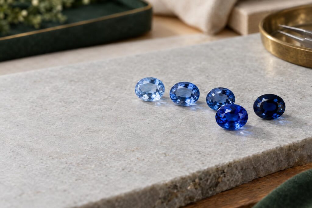
Why colour matters so much in a coloured gemstone
You have probably seen phrases like “medium-dark tone”, “vivid saturation” or “slightly violetish blue” in stone descriptions. These words describe a stone’s colour, and they are hard to follow if no one has explained them. This article explains each one, so you can read a description and know what to ask before you choose.
Why does colour come first? For coloured gems, colour is the highest priority and the most important factor in judging quality 1. The same holds for individual stones. Colour affects a sapphire’s value more than anything else 2. Colour is the most important quality factor for ruby 4. And professionals generally agree that emeralds are, above all, about colour 3.
Why isn’t “a nice blue” enough? Each gem has its own preferred colour range, made from a mix of hue, saturation and tone, and for many gems that colour is scarce 1. This article covers coloured stones only. For diamonds, see The 4 Cs of Diamonds.
Why colour is split into hue, tone and saturation
Why three parts? Because one word can’t capture how a colour looks. Colour science describes three dimensions of colour: hue, saturation and tone 1. Hue is your first impression of a colour, and tone and saturation modify it 6.
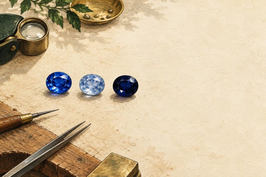
An everyday comparison helps. Picture a paint shop. Picking the paint colour is like choosing the hue. Adding white or black makes it lighter or darker, which is like tone. Stirring in grey dulls it, which is like lower saturation. In gem grading, grey changes saturation, not tone 6.
Hue: which colour you see
Why does hue matter? It is the colour name you would give the stone at a glance. Hue is the pure spectral colour: the main colour plus any extra colours visible in the gem, such as blue, greenish blue or orangy red 5. The GIA grading system uses 31 hues 6.
The extra colour is called a secondary hue. In “greenish blue”, blue is the main hue and green is the extra one. A stone showing one pure hue face-up (looking straight down through the top, as it sits in a ring) is usually worth more than one showing several. For example, evenly blue sapphires are worth more than ones with secondary green 1.
Tone: how light or dark
Why does tone matter? It decides whether a stone looks pale, rich or almost black. Tone is how light or dark a colour looks, and in the GIA system it runs from very light to very dark, with five levels in between 5. GIA’s tone scale has 11 steps, from 0 to 10, but only steps 2 to 8 are actually used 6.
Both ends of the scale carry a cost. Pale colours are usually worth relatively little. Stones so dark that it’s hard to see through them are harder to sell, and usually worth much less 1.
Saturation: how strong or pure
Why does saturation matter? It is the difference between a colour that looks strong and one that looks dull. Saturation, sometimes called intensity, is the strength or purity of the hue. The GIA system has six levels, from brownish or greyish up to vivid 5.
At the low end, the colour is mixed with grey or brown. Grades 1 to 3 can carry a grey or brown modifier (an extra word describing that grey or brown), and grades above 3 don’t. Cool colours such as green and blue look greyish at low saturation, while warm colours such as red, orange and yellow look brownish 6.
Why the three only make sense together
Why can’t you judge one part on its own? Because the colour graders value most is different for each gem. Each gem variety has its own preferred hue, tone and saturation 5.
A JCK article on colour grading compares ruby and aquamarine. It describes the top ruby as pure red with a medium-dark tone and vivid saturation. For aquamarine, it places the most valued tone lighter, at medium-light to medium, and says its saturation probably won’t go above medium 5. So it helps to check a tone description against the range given for that particular gem.
For ruby and emerald, sources describe a balance between saturation and tone. The highest-quality rubies have vivid saturation without being too dark 4. The most desirable emeralds also pair vivid saturation with a tone that isn’t too dark 3.
A phrase like “dark blue” names a hue and a tone, but says nothing about saturation. If a listing leaves out one of the three parts, you can ask the seller for it.
What the most valued colour looks like in popular gemstones
Why look at examples? Because the most valued colour is different for each stone. Here is how the sources describe the colours graders value most:
What the most valued colour looks like
Each gem variety has its own preferred hue, tone and saturation. Switch between five stones to see how the most valued colour differs from one to the next.
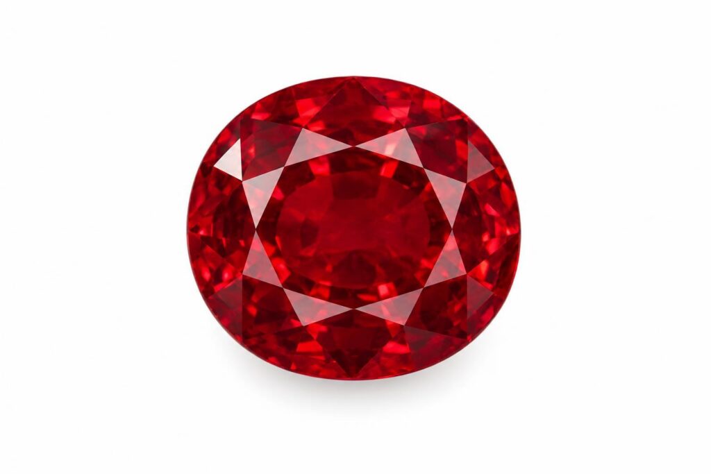
- Ruby
- The most valued rubies are pure, vibrant red to slightly purplish red. The top ruby is pure red with a medium-dark tone and vivid saturation. Red that is too orangy or too purplish is less desirable.
- Blue sapphire
- The most valued blue sapphires are velvety blue to violetish blue, in medium to medium-dark tones, with strong to vivid saturation. Greyish, too light or too dark stones are less valuable.
- Orange sapphire
- The most valued orange sapphires are strong, pure orange to red-orange. They have a medium tone and vivid saturation.
- Emerald
- Emeralds are above all about colour. The most desirable ones range from bluish green to pure green.
- Aquamarine
- For aquamarine, the most valued tone is lighter, at medium-light to medium. Its saturation probably won't go above medium, so a lighter stone is not a weaker one.
Colours on a screen vary, and real stones change with lighting and cut. These pictures are a guide to hue, tone and saturation, not a colour match for any particular stone. Pictures: AI-generated illustrations, checked for accuracy. They are not photographs of a real piece.
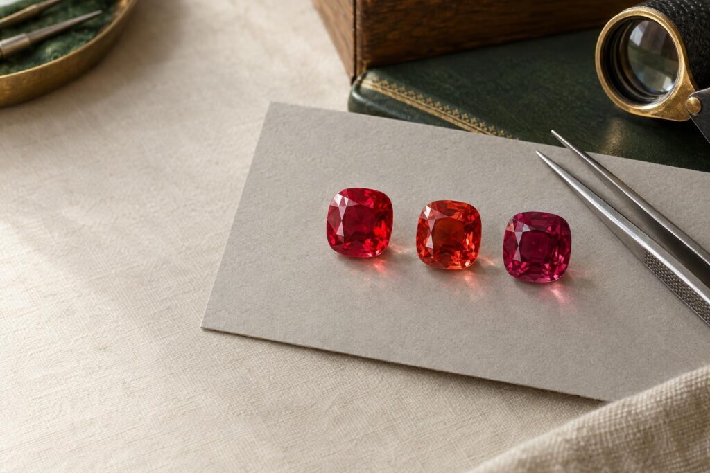
- Ruby: the most valued rubies are pure, vibrant red to slightly purplish red. Red that is too orangy or too purplish is less desirable 4.
- Sapphire: the most valued blue sapphires are velvety blue to violetish blue, in medium to medium-dark tones, with strong to vivid saturation. Less valuable ones may be greyish, too light or too dark. The most valued orange sapphires are strong, pure orange to red-orange, with medium tone and vivid saturation 2.
- Emerald: the most desirable emeralds are bluish green to pure green, with vivid saturation and a tone that isn’t too dark. If the hue is too yellowish or too bluish, the stone isn’t emerald but another kind of beryl, and it’s worth less 3.
- Aquamarine: grading places its most valued tone lighter, at medium-light to medium, with saturation that probably won’t go above medium 5.
Evenness counts too. The most prized emeralds have colour spread evenly, with no colour zoning (bands or patches of different colour) visible to the eye 3. For sapphire, in general, the more intense and even the colour, the more valuable the stone 2.
For more on individual stones, see How to Buy a Sapphire, How to Buy an Emerald and Aquamarine.
Why lighting and cut can change the colour you see
Why can the same stone look different in two places? Lighting matters. Incandescent light can make a ruby look redder and hide its secondary purple 5. For grading, coloured stones are judged face-up, ideally in north daylight, or south daylight in the southern hemisphere 6.
Cut matters as well. Poor faceting (the cutting of a stone’s flat, polished faces) can wash out its colour or make it look muddy 1. Windowing, where light leaks straight through the stone, and extinction, where dark areas appear, can lower the colour grade 5.
When the most valued colour isn’t the right choice for you
Why might the most valued colour not suit you? Because buyers don’t all want the same thing from a stone. Some buyers prefer less saturated stones because they look brighter and sparkle more 1.
Scarcity also affects price. For many gems, the most valued colour range is scarce 1. If budget matters to you, stones a little away from the most valued hue, tone or saturation may be worth seeing side by side.
Words also have limits. Lighting can hide a secondary hue 5, so a description read on its own may not show how a stone looks in other light.
If the most valued colour matters most to you, the facts above show what to look for. If brightness, budget or personal taste matter more, a different balance may suit you. The decision is yours.
How to use hue, tone and saturation when you compare gemstones
Why have a method? It helps you read a description for yourself, rather than relying on a seller’s summary. These steps put the ideas above into practice:
- Ask for all three parts of the colour, and compare them with the range for that gem, since each gem variety has its own preferred hue, tone and saturation 5.
- Check the hue for a secondary colour, and whether you see one pure colour face-up or several 1.
- Look for grey or brown in the colour. For blue sapphire, greyish stones are among the less valuable 2.
- View the stone face-up, the way graders judge coloured stones, ideally in daylight 6.
Treatment is a separate topic with its own pages: see Heat Treatment in Gemstones and How Gemstone Treatments Should Be Disclosed. To see how colour fits alongside the other factors, read How Coloured Gemstones Are Evaluated.
If you’d like help comparing stones, we offer a free consultation, online from any country at bookings.ralphjacobs.org, by WhatsApp, or at our Secunda showroom. We can source a wide range of coloured gemstones as a centre stone.
Frequently asked questions
They work as a set. Each gem’s preferred colour is a mix of all three. Pale stones are usually worth relatively little, very dark ones much less, and one pure hue is usually worth more than several 1. The balance graders value differs from gem to gem.
It points to low saturation. On GIA’s scale, grades 1 to 3 can carry a grey or brown modifier. Cool colours such as blue and green look greyish, and warm colours such as red and orange look brownish 6.
To some eyes, yes. Some buyers prefer less saturated stones because they look brighter and sparkle more 1. Whether that matters more to you than the most valued colour is your choice.